This is an excerpt of pages 85-89 of Eric Meyer on CSS, constituting the middle of Project 4, "Bringing Hyperlinks to Life." A couple of sidebar notes were dropped from this excerpt, but otherwise the text is the same. It's even styled very similarly to the printed book, thanks to a slightly modified version of the stylesheet from Project 13! If you'd like to experiment with the files that were used to produce the Figures in this excerpt, download the project archive for Project 4.
The Icons
The relatively simple nature of the icons (each is a single image alone in a link element) makes them easier to work with. We'll tackle the left-side icons first. We know that each icon is 50x50 pixels. We also know that we want them to sit in the left-side panel with no extra space around them, so we need to convert them to block-level elements with no margin. But we need to be careful about what we convert!
Two Blocks?
Yes, we've set both the hyperlinks and the images to be block-level elements. There are a number of reasons for this, but the most important is consistency. By making both elements blocks, we can be assured that they'll behave in a predictable way—, sort of like one DIV inside another. If we left the images alone, they default to being inline elements, which can cause unexpected space to appear in recent browsers.
td#main {background: #FFD; color: black;
  border: 2px solid #797; border-width: 2px 2px 2px 1px;}
td#navbuttons a {display: block; margin: 0;}
td#navbuttons img {display: block; height: 50px; width: 50px;}
</style>
This won't have any immediate visual impact, but it avoids trouble in the next step. We want to increase the amount of space around each image, but rather than doing it with margins, let's do it with borders that exactly match the background color of the cell. We'll also set the background color of the images to be transparent so that the cell background remains visible around each icon.
td#navbuttons a {display: block; margin: 0;}
td#navbuttons img {display: block; height: 50px; width: 50px;
  border: 1px solid #ACA; border-width: 5px 10px;
  background: transparent;}
</style>
Okay, so besides adding some apparently empty space around the icons, what good did this do? Plenty. Assume that the current page is the Natural Gas page. We can highlight the icon by adding a rule that makes the border and background the same color as the intracell borders (see Figure 7).
td#navbuttons a {display: block; margin: 0;}
td#navbuttons img {display: block; height: 50px; width: 50px;
  border: 1px solid #ACA; border-width: 5px 10px;
  background: transparent;}
td#navbuttons img#gas {border-color: #797; background: #797;}
</style>
Figure 7
Highlighting an icon with borders and background.
The big win we get here is not just that we can easily indicate the current page, but also that the background and border colors change when the link is hovered over by the mouse pointer or when the icon is clicked.
td#navbuttons img#gas {border-color: #797; background: #797;}
td#navbuttons a:hover {background: yellow;}
td#navbuttons a:hover img { border-color: yellow;}
td#navbuttons a:active img {border-color: #FC0;
  border-style: inset;}
</style>
Now any link (other than the one for the current page) will get a yellow background when hovered over. If an icon is clicked, its border will turn orange, thus framing the link for a moment in a thick orange box with the yellow background still visible inside (see Figure 8).
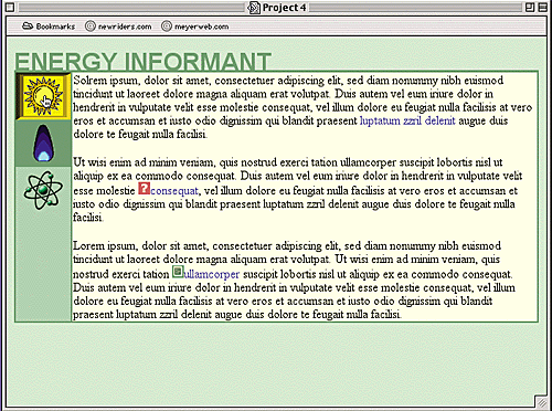
Figure 8
Combining hover and active styles can lead to interesting effects.
It's worth spending a moment on the selectors. Take, for example, td#navbuttons a:hover img. It's written this way because we want to give a yellow highlight to any image that's descended from a link being hovered over—both of which are contained within a tdelement with an idof navbuttons. Ditto for the "active" rule.
No Hover for the "Current" Icon
So why doesn't the icon for the current page (the gas flame) take on the hover or active styles? Because the specificity of its selector (td#navbuttons img#gas) outweighs the selectors for the hover and active states, so its values for the border and background colors win out.
It's worth asking, though, why we set the background color on the hyperlink instead of for the image itself. It turns out that IE5.x for Windows mostly ignores background styles on images that are part of hovered links. This failure is very odd because it will change the border color, but there you have it. Because IE5.x will set the background of the hyperlink, we can sneak around this bug in the manner shown. If you're developing for a situation in which IE5.x isn't an issue, you could just style the background of the image and not mess with the link's background at all.
Altering the Main-Text Links
With the left-side icons working the way we'd like, let's give the text links a makeover. Our first order of business is to define a "baseline" for the text links. Typically, designers will change the color of a link in its various states, and sometimes they'll forcibly remove the underlines.
In this case, we're just going to change the colors but leave the underlines alone. That way, the user's preference setting regarding link underlining will hold sway, which will help them recognize links for what they are. Because the blue doesn't really work with our green-and-sand color scheme, though, we're going to make the links a dark green when unvisited and dusky purple when visited. Just to make sure the links stand out, let's boldface them as well.
Splitting Up The Styles
We split the styles between the a:link, a:visited and the a:link and a:visited rules in order to keep them as simple as possible. Otherwise, we would have been duplicating the background-color and font-weight styles for both link states, which doesn't make much sense.
td#navbuttons a:active img {border-color: #FC3;
  border-style: inset;}
a:link, a:visited {background-color: transparent; font-weight: bold;}
a:link {color: #171;}
a:visited {color: #747;}
</style>
Now we need a good hover style. Actually, we need two good hover styles: one for unvisited links and one for visited links:
a:visited {color: #747;}
a:visited:hover {color: #FFD; background-color: #747;}
a:link:hover {color: #FFD; background-color: #797;}
</style>
Now we get a reverse-text effect on all our links. In CSS2-aware browsers, we'll get yellow-on-green for hovered unvisited links and yellow-on-purple for hovered visited links (see Figure 9). It doesn't matter what order these rules come in because they can never conflict with each other. That's because a link can't be both visited and unvisited.
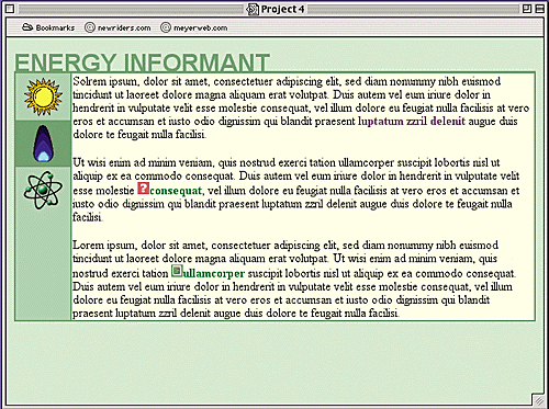
Figure 9
When changing the appearance of links, it's best to make sure they still stand out.
Dealing With Explorer (Again)
If you use this form of "chained" selector shown for your hover styles, make sure that you put the default second—that is, whichever hover style you'd prefer to be applied to all links in a document, visited or otherwise. Explorer doesn't understand this syntax, and so it will treat all such rules as if they're simple a:hover rules.
Another problem that you might encounter in Explorer is that it thinks the last link that was clicked is still "active." Therefore, if you click a link and then hit the "Back" button, the page will come up with the link still in the "active" state even though it isn't active. Given this fact, you might want to avoid writing a:active styles if Explorer users will make up a big portion of your audience.
Help! A Press Release!
Now that we've done the basic style work on text links, let's jazz up the help and press-release links. The icons are cute enough, but we can do something a lot more interesting than having these graphics embedded in the page itself.
The first thing we need to do is remove the icons from the HTML and create taller versions—say, 32 pixels high instead of 16. The important thing is that the icons should be an even number of pixels tall.
Now let's put a border around the help link, place the icon in the background, position it on the left side and centered vertically, set padding to keep the text from overlapping the icons, and also change the text and background colors to go along with it (see Figure 10). Oh, and just for the heck of it, we'll eliminate the underline, too.
a:link:hover {color: #FFD; background-color: #797;}
a.help:link, a.help:visited {padding: 0 2px 1px 16px;
  background: #FDD url(help-icon.gif) left center no-repeat;
  color: #733; border: 1px solid #C66;
  text-decoration: none;}
</style>
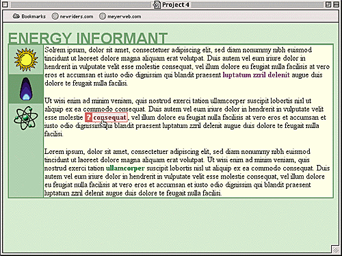
Figure 10
Taking a text link from "blah" to "boo-yah!"
By aligning the background image with the left centerpoint of the link (using the keywords left center), we can make it look like it's inline. As for the padding, it helps keep the borders pushed a little bit away from the text and opens up enough space on the left to show the background image. It's easy enough to adjust the padding as necessary (for example, to close up the space between the edge of the icon and the text).
It looks like the icon is still part of the document, and that's exactly what we want. The advantage of putting it in the background of the link, of course, is that we can easily change it later without having to touch the document source. We might decide to put the icon on the right side of the hyperlink, for example. Doing that would be a simple matter of changing the values for padding and background—nothing more.